From the Series
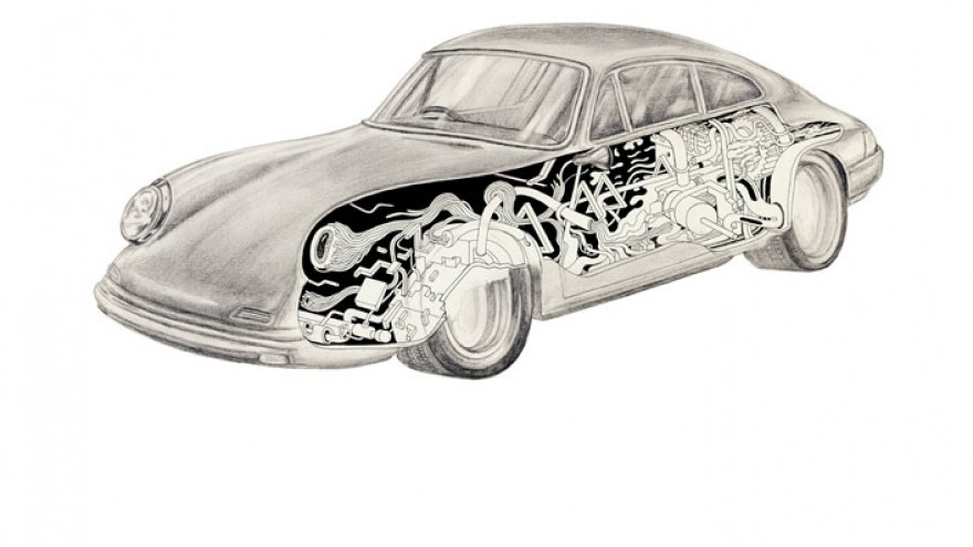
As part of the ongoing collaboration between Gavin Rooke of Dutchmann and Porsche restorer Tim Abbott, the “Weekend Racer” project now presents a collection of posters designed by a number of South African graphic designers and illustrators.
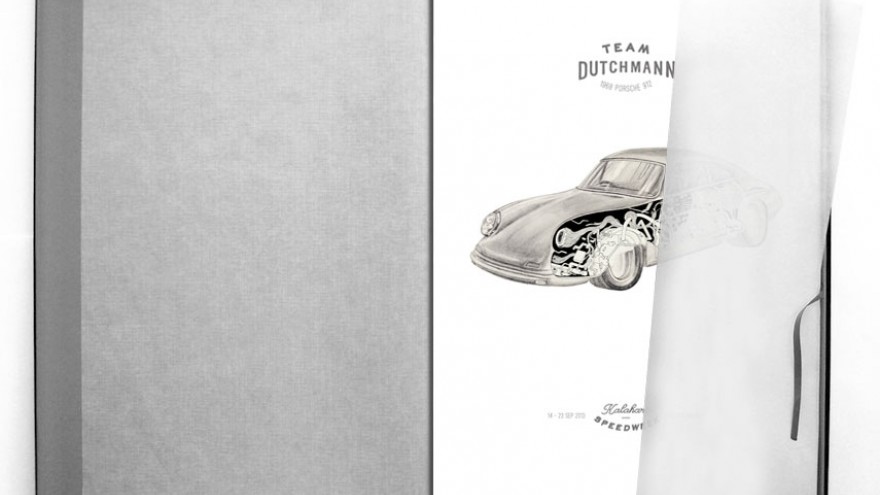
The Racing Poster Portfolio comprises a series of posters to commemorate the redesign of a 1968 Porsche 912, “Weekend Racer” and its entry into the 2013 Kalahari Speed Week. Ten designers were selected by Durban-based designer Warwick Kay and briefed to create a contemporary interpretation of a classic racing poster to commemorate the event as well as the project.
The resulting portfolio represents Dutchmann’s ambitions of highlighting the calibre of South African craftsmen and the possibilities of fusing art and innovation with craft-based practices.
Below is a list of the participating designers and what each had to say about their poster:
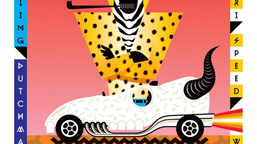
Richard Hart: “ The cheetah is the fastest animal on the African plains. Or is it?”
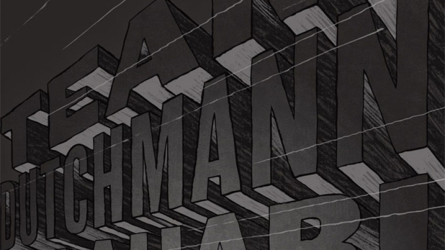
Brandt Botes: “I have always loved transport posters from the mid-1900s, especially ones depicting trains. They capture such an incredible sense of speed and direction in simple, bold layouts with a minimal colour palette. This, and the Zen nature of Hakskeen Pan served as inspiration."
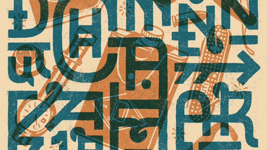
Clint Campbell: “My aim was to keep an authentic, printed poster feel by working with a limited two-colour palette and a gritty use of texture. I created a geometric pattern from the type, with a disregard for legibility and then interlaced this with a series of illustrated elements that were inspired by a retro, bad-ass lifestyle aesthetic.”
Jon Del: “The native illustration style of the outside of the car is retro 60s inspired because the Porsche is originally from 1968. But there’s also a bit of African street sign inspiration, the kind of thing you can imagine painted on the wall of an old workshop somewhere in the Kalahari. The typography brings it all back to 2013.”
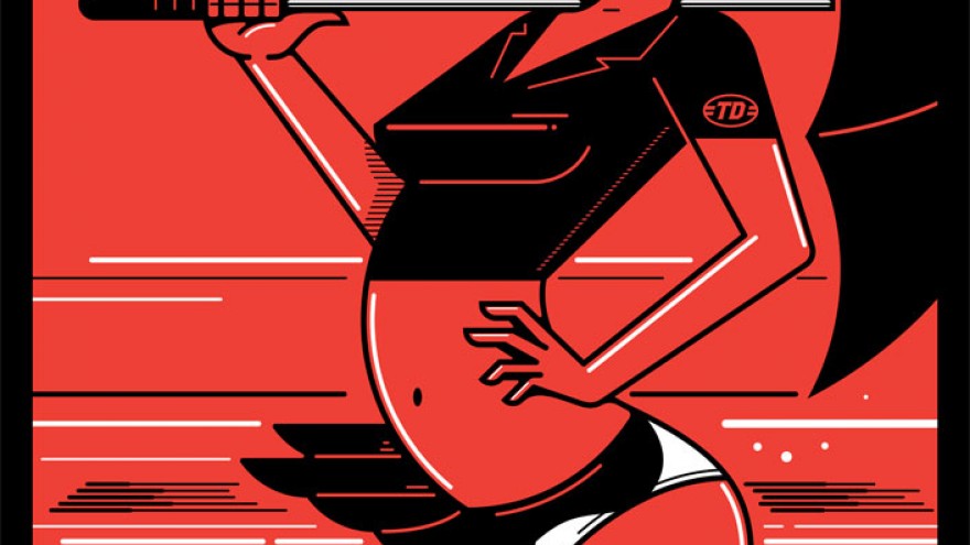
Kronk: “I wanted to show the sexy side of racing by focusing on the eye candy, that is the 'brolly' girl. Often overlooked, they perform a small function, but are an iconic part of the racer’s team. I also wanted to show the sheer speed of the vehicles involved using simple motion lines or racing stripes. By bringing these two elements together, the image highlights the beauty and speed that can only be found at the races.”
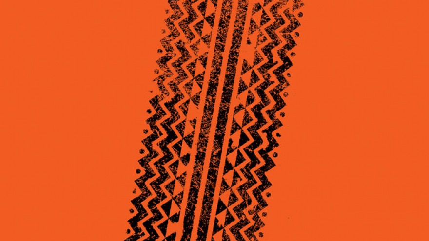
Matt Kay: “Kalahari Speed Week – warm red sand, snake-like African patterns and acceleration marks.”
Michael MacGarry: “My poster artwork wanted to reference an irreverent 1980s muscle car aesthetic, coupled with a vernacular colour palette and a comic sensibility, whilst utilising my individual Dutchmann world-mark design. I think.”
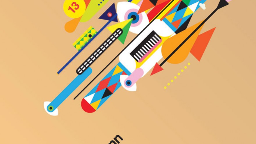
Paul Garbett: “I set out to express the raw emotion and energy of motor racing through abstract shapes and colour. Once completed, I showed this poster to my son, Finn (5) and asked him what he saw. He answered a ‘whole lot of people racing each other’. I said yes!”
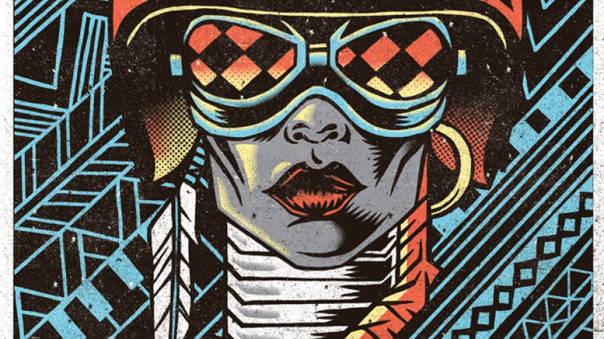
Sindiso Nyoni: “The poster fuses Zulu/Ndebele pattern art, and traditional Nguni gear with retro racing gear, to suggest an Afro-futuristic approach within a South African context.”
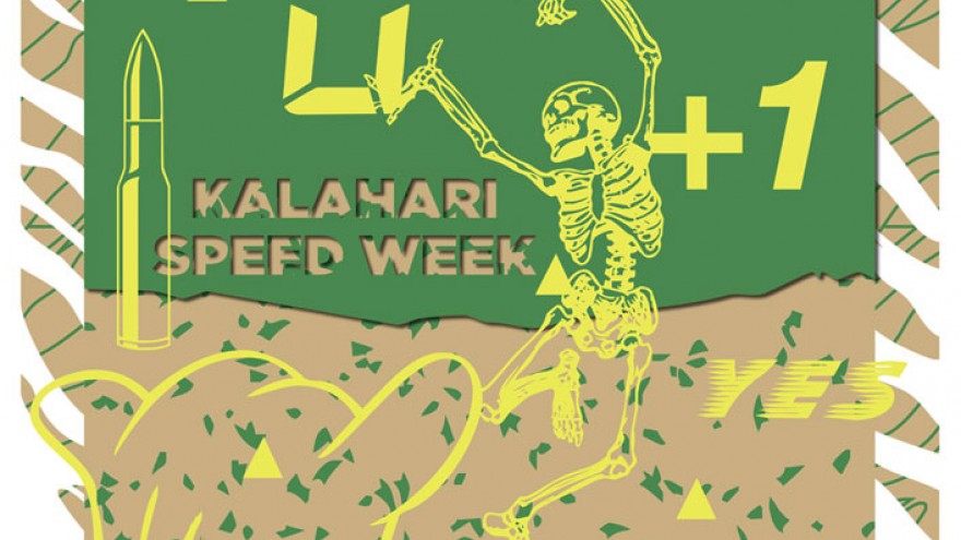
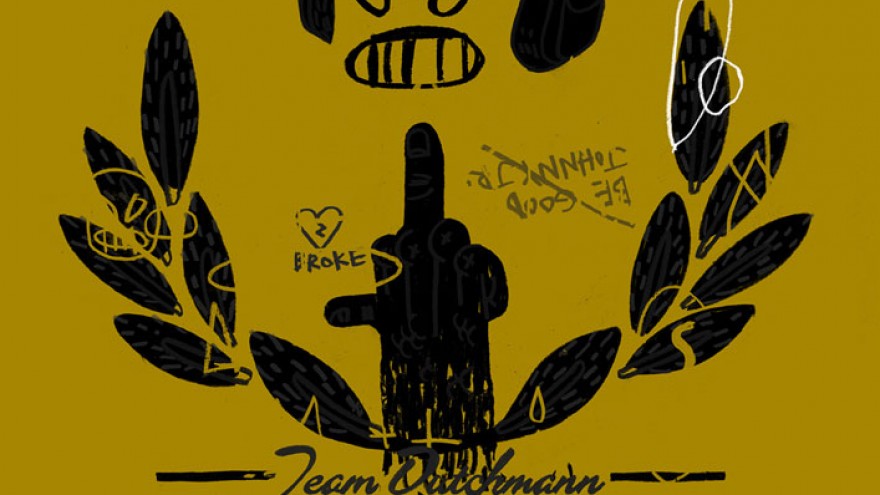
Skullboy: “Following the general aesthetic principles from early vintage racing posters, I chose to create something beautiful, well-crafted and visually interesting. After many hours, I was almost complete with my initial piece when I remembered Johnny Hotrod by Nashville Pussy and decided to burn the whole lot to the ground. Because that’s what Johnny JR would have done.”
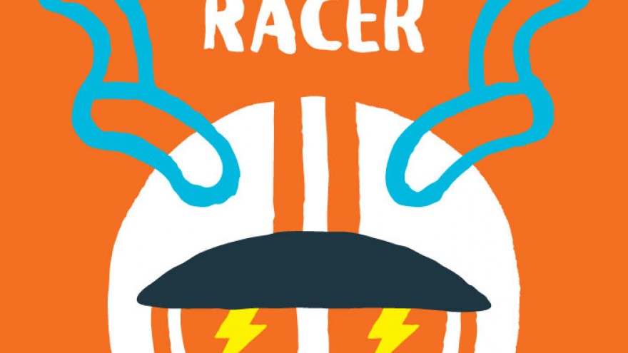
Warwick Kay: “With over-the-top kudu horns and lightening-possessed eyes, the South African speed demon gets right up in your face. He casually says ‘howzit’ just before leaving you in the red dust of the Kalahari.”
The Racing Poster Portfolio is available at R3 500 for a set here.
Read more about the "Weekend Racer" project.

