


First Published in

Cities, Architecture and Society focused mainly on 16 cities on four continents around the world: Barcelona; Berlin; Cairo; Caracas; Istanbul; Johannesburg; London; Los Angeles; Mexico City; Milan-Torino; Mumbai; New York; São Paulo; Shanghai and Tokyo.
The curator, British architect Ricky Burnett, has emphasised the social transformations of cities and this has strongly influenced the themes of the individual national pavilions. None more so than the South African exhibition – where architecture serves primarily as material for the social investigation of how our cities have transformed both materially and psychologically in the 12 years since the end of apartheid.
South African curator Mphethi Morojele focused on two primary concepts in his reading of the South African built environment – namely Ownership and Belonging. Morojele cites authors Prof. Achille Mbembe and Sarah Nuttall who detail the process of social integration as taking place: “Between Ownership and Belonging: where previously disenfranchised citizens need to develop a sense of ownership and the disenfranchised a sense of belonging. The public terrain in South Africa’s post-apartheid/post-colonial city-scape is in the process of being negotiated.” (1)
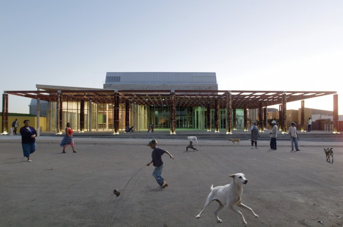
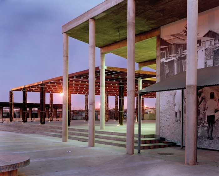
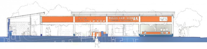
Morojele acknowledges the monumentalising of South Africa’s painful historical memory as an agent for change and healing. This is coupled with the increasing role of transport nodes as focus points in contemporary urban design. The principal projects featured are Red Location Museum of Struggle (Port Elizabeth) pictured on this page; District Six Redevelopment (Cape Town); Constitutional Hill (Johannesburg); Walter Sisulu Square of Dedication (Soweto); Phillippi Public Transport Interchange (Cape Town); Faraday Station (Johannesburg) and Warwick Junction Urban Renewal (Durban).
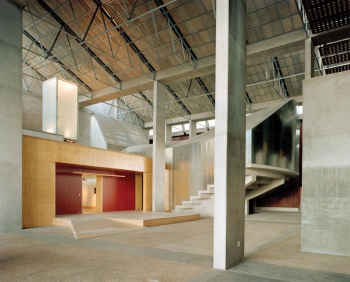
The remaining four projects within the 144m2 double volume exhibition space comprise two locally produced short films; a photographic essay and a graphic-based urban geography study.
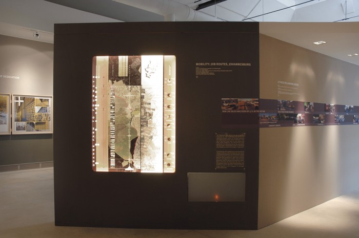
The two-dimensional component of the exhibition features 15 1m2 and 56 A3 box-framed design elements – and to a large extent we limited our design solutions within these devices. As the exhibition is documentary- and image-driven, we used large-scale Lamda prints within the simple box frames. This allows the remarkable photography, drawings and renderings of each project to speak for themselves.
The functional, modular design of the box-framed elements feature a three tier hanging system that the 1m2 and A3 box frames are attached to. Angled slats on the back of the frames rest on the three angled, wooden tracks fixed to the walls. This design allows the box frames to be freely moved around and arranged in random, geometric compositions. These devices are annotated by vinyl signage; vinyl wallpapers; explanatory texts; audiovisual components and location maps. The wood and perspex box frames also allow easy transport, as the exhibition will travel to the Royal Institute of British Architects (RIBA) in London after the Biennale.
As the exhibition features 12 distinct projects, their individual look and feel have been generated along project-specific lines. This allows the viewer to easily distinguish between each section and creates a diverse and multi-layered exhibition. The minimal vinyl signage sits above this field and facilitates ease of use. The clean lines of the hanging mechanism that circumnavigates the whole room and the standardised, modular design of the framed components keep the busyness of the different projects in check.
Another feature we’ve used to contain the contrasting projects is the subtle two-tone wall colouring. Our chosen palette consists of Pantone 405 and 402, with Pantone 158 our primary highlight colour. The main font family used throughout is MetaPlus – chosen because of its multiple weights and advanced legibility. All the printed materials accompanying the exhibition have been produced on uncoated stock to give a raw, tangible feel – in keeping with the textural and structural character of the exhibition’s primary identity design. The printed components include a 48-page exhibition catalogue, press pack, business cards and posters.
Between Ownership and Belonging: Transitional Space in the Post-Apartheid Metropolis was curated by Mphethi Morojele of MMA Architects in Johannesburg and commissioned by the Departments of Arts and Culture; Foreign Affairs and the South African Heritage Resource Agency. The exhibition’s graphic design was produced by Lou Louw (Project Manager), Johan van Wyk (Art Director) and Michael MacGarry of Johannesburg-based consultancy Fever Identity Design.
Cities, Architecture and Society focused mainly on 16 cities on four continents around the world: Barcelona; Berlin; Cairo; Caracas; Istanbul; Johannesburg; London; Los Angeles; Mexico City; Milan-Torino; Mumbai; New York; São Paulo; Shanghai and Tokyo.
The curator, British architect Ricky Burnett, has emphasised the social transformations of cities and this has strongly influenced the themes of the individual national pavilions. None more so than the South African exhibition – where architecture serves primarily as material for the social investigation of how our cities have transformed both materially and psychologically in the 12 years since the end of apartheid.
South African curator Mphethi Morojele focused on two primary concepts in his reading of the South African built environment – namely Ownership and Belonging. Morojele cites authors Prof. Achille Mbembe and Sarah Nuttall who detail the process of social integration as taking place: “Between Ownership and Belonging: where previously disenfranchised citizens need to develop a sense of ownership and the disenfranchised a sense of belonging. The public terrain in South Africa’s post-apartheid/post-colonial city-scape is in the process of being negotiated.” (1)
Morojele acknowledges the monumentalising of South Africa’s painful historical memory as an agent for change and healing. This is coupled with the increasing role of transport nodes as focus points in contemporary urban design. The principal projects featured are Red Location Museum of Struggle (Port Elizabeth) pictured on this page; District Six Redevelopment (Cape Town); Constitutional Hill (Johannesburg); Walter Sisulu Square of Dedication (Soweto); Phillippi Public Transport Interchange (Cape Town); Faraday Station (Johannesburg) and Warwick Junction Urban Renewal (Durban).
The remaining four projects within the 144m2 double volume exhibition space comprise two locally produced short films; a photographic essay and a graphic-based urban geography study.
The two-dimensional component of the exhibition features 15 1m2 and 56 A3 box-framed design elements – and to a large extent we limited our design solutions within these devices. As the exhibition is documentary- and image-driven, we used large-scale Lamda prints within the simple box frames. This allows the remarkable photography, drawings and renderings of each project to speak for themselves.
The functional, modular design of the box-framed elements feature a three tier hanging system that the 1m2 and A3 box frames are attached to. Angled slats on the back of the frames rest on the three angled, wooden tracks fixed to the walls. This design allows the box frames to be freely moved around and arranged in random, geometric compositions. These devices are annotated by vinyl signage; vinyl wallpapers; explanatory texts; audiovisual components and location maps. The wood and perspex box frames also allow easy transport, as the exhibition will travel to the Royal Institute of British Architects (RIBA) in London after the Biennale.
As the exhibition features 12 distinct projects, their individual look and feel have been generated along project-specific lines. This allows the viewer to easily distinguish between each section and creates a diverse and multi-layered exhibition. The minimal vinyl signage sits above this field and facilitates ease of use. The clean lines of the hanging mechanism that circumnavigates the whole room and the standardised, modular design of the framed components keep the busyness of the different projects in check.
Another feature we’ve used to contain the contrasting projects is the subtle two-tone wall colouring. Our chosen palette consists of Pantone 405 and 402, with Pantone 158 our primary highlight colour. The main font family used throughout is MetaPlus – chosen because of its multiple weights and advanced legibility. All the printed materials accompanying the exhibition have been produced on uncoated stock to give a raw, tangible feel – in keeping with the textural and structural character of the exhibition’s primary identity design. The printed components include a 48-page exhibition catalogue, press pack, business cards and posters.
Between Ownership and Belonging: Transitional Space in the Post-Apartheid Metropolis was curated by Mphethi Morojele of MMA Architects in Johannesburg and commissioned by the Departments of Arts and Culture; Foreign Affairs and the South African Heritage Resource Agency. The exhibition’s graphic design was produced by Lou Louw (Project Manager), Johan van Wyk (Art Director) and Michael MacGarry of Johannesburg-based consultancy Fever Identity Design.


