The Olympics showcase excellence, achievement, greatness… The event is a chance for those at the very top of their game to shine. It’s also an opportunity for the designers who create the stadiums, logos, Olympic cauldron and relay torch – all the details that make the games work well and look good – to show their mettle. Here’s the #DI guide to Gold Medal design at the Tokyo 2020 Olympics.
Ariake Gymnastic Centre – NIKKEN SEKKEI + SHIMIZU CORPORATION
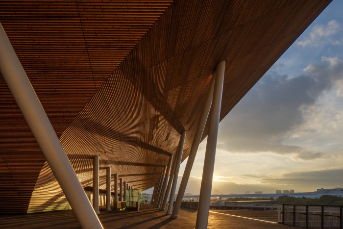
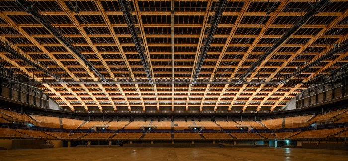
The Ariake Gymnastics Centre was designed by NIKKEN SEKKEI in association with SHIMIZU CORPORATION for The Tokyo Organizing Committee of the Olympic and Paralympic Games in Tokyo, Japan. It is designed to function in two phases: as a temporary international sports competition facility, and as a permanent exhibition hall (with spectator stands removed). Extensive use of timber is the stadium’s standout feature; the material has been used wherever possible, with careful consideration for the characteristics of wood in specific applications. The Centre has been described by the firm as “a wooden vessel floating on the bay.” In designing a simple, beautiful silhouette - the essence of Japanese traditional wood architecture – the teams have achieved a shape that’s long rather than tall, with flowing lines that respond to the canal and to the open cityscape.
Winners podiums by Asao Tokolo
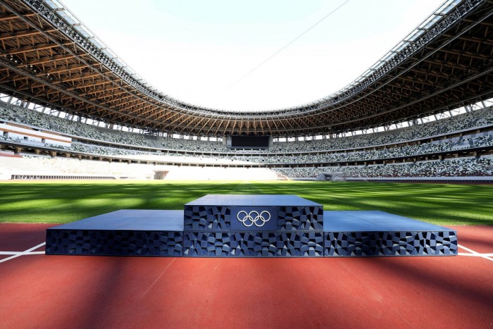
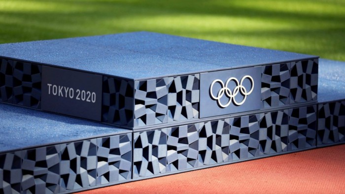
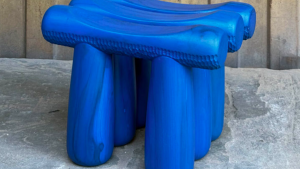
The winners at this year’s Tokyo 2020 Olympics and Paralympics will receive their accolades on podiums designed by Japanese artist Asao Tokolo. There is more to these podiums than meets the eye – the 98 podiums that will be used throughout the games were made from 24.5 tonnes of discarded household plastics donated by the Japanese public and dropped off in collection boxes in department stores and schools across Japan. The plastic was then recycled and used to 3D print the podiums, which are constructed of a number of small cube-shaped modules that connect to form the traditional three pedestals. They also bear the same chequerboard pattern that the artist developed for the Games’ logo.
Olympic Torch by Tokujin Yoshioka
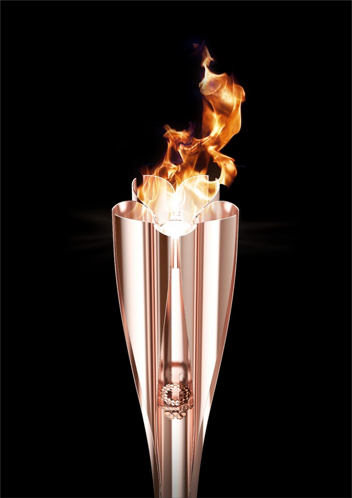
Designed by Japanese artist and designer Tokujin Yoshioka, the Olympic Torch is a petal-like design inspired by Japanese cherry blossoms. The cherry blossom is a symbol often associated with Japan, but the five petals of the lightweight, seamless torch each hold a separate flame, which come together as one at the centre of the torch, symbolising peace.
The torch is made of 30 percent recycled aluminium, originally used in the construction of prefabricated housing units in the aftermath of the Great East Japan Earthquake. The temporary units used to house those affected by the disaster have been transformed into the Olympic Torch, and communicate the steps taken toward reconstruction of the disaster-affected areas.
Here’s more:
Visit nikken.co.jp, tokolo.com and tokujin.com.

