First Published in
David Carson is from southern California; San Diego to be exact. You can't help feeling that this has bearing on his work. A top-ranked competitive surfer, sociology teacher and self-taught designer, Carson's immense output seems to reflect something of the anxious mythology of his environs. San Diego is a large US Navy port, an unmistakable part of the US military-industrial complex. The vast suburban sprawl that surrounds it is home to countless skaters and extreme sports fanatics, with the whole heady suburbia sitting plump on top of a huge seismic faultline. And then there is Tijuana, that dubious town just on the Mexican side of the border that holds a mirror up to the United States’s ugliness. If David Carson’s southern California is paradise, it is certainly a troubled one.
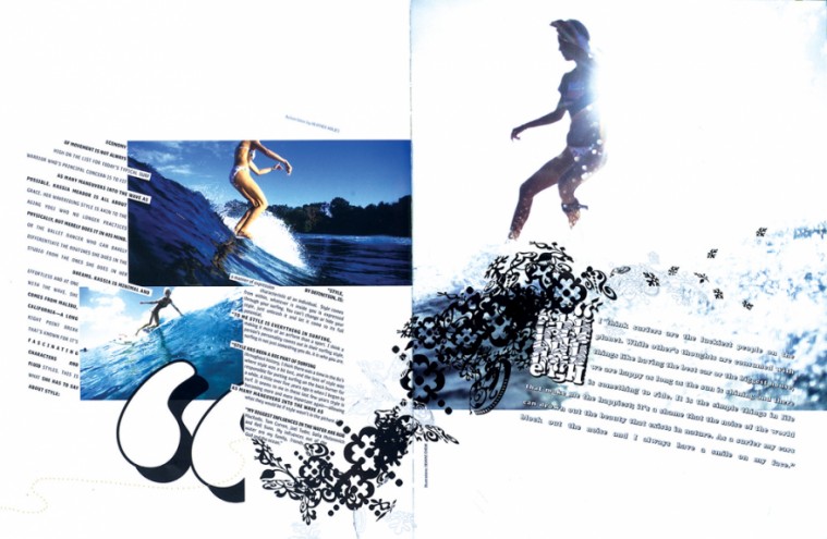
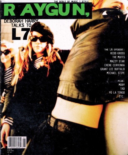
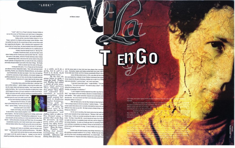
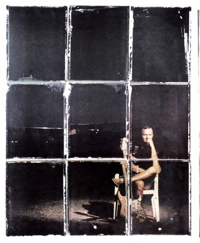
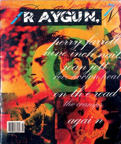
Despite these faultlines and anxieties, David Carson continues to work out of San Diego, pioneering new attitudes to print design and generally freaking out the establishment. His design career started with stints on the southern Californian titles. Transworld Skateboarding, Surfer and Musician. He achieved minor celebrity status while art-directing Beach Culture, a short-lived surfer magazine that won 150 design awards in the six issues it ran. It was, however, the title Raygun that catapulted him to fame. A stock music and lifestyle publication, Carson experimented with the magazine's layout to the point where form was Raygun's only visible offering. Words were incidental.
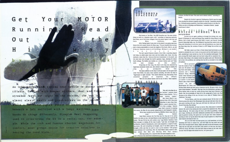
Of course, such a comparison might read like a bit of wanton hyperbole, but David Carson is by no means your run-of-the-mill print designer. His book The End of Print (Chronicle Books, 1995), authored in part by Design Indaba regular Lewis Blackwell, remains one of the bestselling books on design ever. To date it has sold more than 150,000 copies. As former Talking Heads frontman David Byrne notes in the preface to the book, "David [Carson]'s work communicates. But on a level beyond words. On a level that bypasses the logical, rational centres of the brain and goes straight to the part that understands without thinking."
David Carson is not without his detractors. "Carson can't articulate his ideas for shit," wrote Art Chantry in the influential underground 'zine, Punk Planet (#28). "He'd be a superstar in a big, important way if he could just explain what the fuck he's doing. But he can't, because he's an instinct designer." Rick Poynor, founder of Eye magazine and design critic par excellence, offers a slightly more contemplative view on Carson. "The implosion of traditional typography may, like a sloughed skin, be a sign of renewal, or it may prove to have been a mark of millennial anxiety and profound uncertainty in an accelerating culture."
Uncertainty is a key point to understanding the sense of trepidation and malaise in Carson’s work. Having survived Y2K and the dot bomb washout, it’s sometimes hard to remember that many of us unquestioningly believed that the Internet had signalled the end of print (even though the title of Carson’s book was derived from a remark Neville Brody made about his output). But here we are, and Carson has learnt to cleverly - some would argue cynically - employ his radical designs in servicing clients such as Microsoft, Lucent, Xerox, MCI, Armani, Ray Ban and others.
Carson is typically demure about his critics and their accusations that he sold out the essence of his style. "The only cool PR is provided by one's enemies," he told me, quoting a colleague he’s currently collaborating with on an edition of Marshall McLuhan's probes. "They toil incessantly and for free."
You were also a sociology teacher; did you have any particular field of interest?
It was just sociology in general, why and how people interact.
Your design seems to reflect a uniquely southern Californian vernacular, one that captures the raucous energy of the surfing and skating culture there. Would you agree?
When I'm working on something surf/skate culture related, I'd agree that I capture that energy of the subject matter. I like to think I do that with all my work.
Looking through old issues of Raygun magazine, I see you had more than twenty typeface designers consulting on the magazine. What would you saywere some of the outcomes and lessons learnt from such frenzied experiments with type?
It just helped free things up in general. Type designers got to be stars (!) and have their own conferences (!) for a while. It was a fun time, but the fonts that came in the quickest and hardest were always the first to fade out. Hopefully people learned that just using a "cool" font didn't guarantee good design. And hopefully that spirit of experimentation would overflow into other areas, but I'm not so sure that's happened.
Raygun's early contributors included the likes of Spike Jonze and Doug Aitken. Do you still keep in touch or collaborate with any of Raygun's contributors?
I'm still in contact with a lot of them, often through email, and still use some of them when possible. I think Raygun helped launch a lot of illustrators' careers, as well as a few photographers.
Is it true that part of the reason for your departure from Raygun in September 1995 was because of an argument over using David Bowie's neck as cover image?
Yes. It would have possibly been the best cover I did at Raygun, but the publisher and his wife just didn't get it. It helped me realise it was time to move on. I'd been there since the start, and did 30 issues over a three-and-a-half year period.
Who were your early influences? The Z-boys? [A motley 1970s skate crew that included Tony Alva, who shaped contemporary skate graphics.]
Not the Z-boys. Probably early Russian deconstructionists and some of the Dada guys.
Other than David Byrne writing the introduction to The End of Print, have you two collaborated in any other ways?
He's had me do a poster for a film he did, video packaging, and title and credits for a film. Plus we were neighbours in Greenwich Village in New York City.
A quick question about your online work: How was adventurefront.com received? Have you been involved in any other web-based projects?
Adventurefront.com went bust before it ever went up. I think it was headed in a good direction, but it was a dot-com causalty. I have just started work on a website for the Gibbes Museum of Art in South Carolina, am always tweaking my own, and have been sending Quicksilver [a surf clothing company] a bunch of stuff they haven't used yet.
You have many critics. What do you think really irks critics about your designs?
What irks them the most is the following I have worldwide. And its still amazing to me that after all this time ink on paper can still get people so riled up, both positive and negative.
If you had to encapsulate current design in a handful of words, what would they be?
Confused, weak, and overrun by mediocre writers.
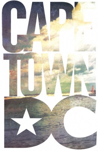
Surf is where it all started for you and, judging by your art direction on an issue of BIG surfing magazine, it is still very much a preoccupation. What's the link between you and the sea, and the sea and your design?
I started out working at Transworld Skateboarding for three-and-a-half years, then went on to Transworld Snowboarding, Musician and Self. I worked for about five years before doing anything surf, which was a bit what Beach Culture was, though it had much more to it. In fact most of the surf guys didn't really understand it. I still think Beach Cultureis some of my best magazine work. Now I do work for colleges, politicians, art museums and Nine Inch Nails. The BIG issue, done almost two years ago, was fun because I'm so familiar with that world, and was able to experiment with some new illustrators and photographers, as well as a new typeface or two. Surfers are always searching, not necessarily on a mission, but always searching. I feel the same way.
After your visit to the 1999 Design Indaba you nipped off to J-Bay. How was it?
I got a fun surf in. Not epic, but one of the fastest waves I've ridden. It was a whirlwind trip, but I was glad I did it.
And how was the Design Indaba? Did it surprise or impress you?
It seemed well run with a lot of interesting creative people - some even on stage. I'll be curious to see how it's developed this year...

