First Published in

Something I have noticed in almost 30 years as a designer - the truly talented are always the nicest. Perhaps it's because they know just how hard this all is. For those of us who worship in The Kingdom (Kwazulu-Natal, Kingdom of the Zulu, a province of South Africa), you will know of what I speak. For the poor lost souls who work with - or for - a shit (or shitess), I urge you to get away quickly. Shits are toxic and very quickly poison the well - and believe me, I've known a few. So keep a beady eye out for the nice ones and work with them chop, chop. Talent is easy to find. Nice - with talent, not so easy... One place to find them, though, is at the Design Indaba, where you'll find the genuine article (and enough padkos (road food) to feed your creative spirit for the rest of the year). Here are a few personal words on 5 such lekker ous (In the order in which I came to know them) ...
Jonathan Barnbrook
The first "World Famous Graphic Designer" I ever met was I'm sad to say, a bit of a "what needles do to your finger". Jonathan Barnbrook was the second "World Famous Graphic Designer" I ever met. Different story. And he spoke to me. And gave me Damien Hirst postcards. And I had just bought his typeface. Good things come in threes. I was a fan for life.
Jon Barnbrook always reminds me of a naughty schoolboy. One you would find in the pages of The Beano. Both typically English. I think he's the most original type designer working today. My studio always seems to attract type fanatics - all of whom are obsessed and inspired by "Barnbrook", his fonts and his design style. He's big in Japan, but also in Amanzimtoti and Oranjezicht too (bet he doesn't know that either). What I particularly like about Jon's type design, is the effort and passion that goes into naming them - never mind the font itself. I'm not sure if the name or the font comes first, but they seem to be made for each other nevertheless. As a designer of crappy typefaces with no use, I appreciate his crafting letterforms based on the history of type. Most font designers rehash fonts that often look better in their original form. Not so Mr B. He almost seems to approach the design and naming of each letterform as a kind of "Jon's household pet". One has the feeling that Barnbrook raises each letter as though it's a potplant or hamster, feeding it, watering it, making sure the nasties don't eat it. Then when it's big enough, the letter has a sort of "21st" birthday (complete with name) before he moves onto designing the next one. The "A" and "T" from Manson (I flatly refuse to call it politically correct, poncy Mason") as examples, are sufficient for a Lifetime Achievement Award. Shit, just to have those two characters in my porty, means I could die happy. Manson is a massively influential piece of type design - and is widely used here in South Africa (generally inappropriately too). And that's just one font. Bastard (his first commercially released typeface) is a fresh take on Gothic lettering. An interesting jumping off point for a new type designer (his Art College wouldn't buy the font - so he designed one himself). At a conference long, long ago, Jon showed a series of TV commercials made for Radio Scotland using his type designs. Without doubt the best "type movies" I have ever seen. Please can we see them again at your next presentation!
His fonts are all highly original - yet they still seem to look familiar. Nixon (another favourite) reminds me of all the Electrolux vacuum cleaners, fridges, Yank tank cars and valve radios I've ever seen - rolled into one. It's quite bit edgy too. A "typeface for liars" - Prozac for the "shoot everyone at school" generation, Delux for conspicuous consumption - and so on. He seems to have a knack of designing (and naming) a font to suit the age. Tellingly, (post 9/11) he has designed a pictogram font, Apocalypso (designed pre 9/11) which includes politically incorrect icons like fatwa , shop until the bomb drops and corporate suffocation. Wonderful stuff and much copied here with Mugabe as the centre of attraction. Shortly to be released are fonts with a more "commercial" appeal, which I'm sure will be a tad unconventional. Though please keep designing the fonts "that don't make any money".
Barnbrook is also a prolific graphic designer, book designer and design activist (he often says he's here to remind designers not to 'lick corporate arse'). He has designed books for the super trendy British artist Damien Hirst - which use pop-ups, cutouts, stickers and so on to tell the Damien story and to show his work. Designed along a medical theme (like much of Hirst's work) the line between medical fact and art essay is pretty fuzzy. The results however, show the proper way to design and publish a book on a major contemporary artist. These kinds of design projects are only available to the truly gifted, so it's no surprise to find that much of his current work is for Japanese clients (surely every designers dream). Electronic fonts for Seiko watches and textile designs using lettering and pictograms are two highly unusual design commissions shown at the Indaba. The textile project was interesting for me, as it demonstrated the kind of client thinking we lack here - namely to cross-pollinate design disciplines. Lekker stuff indeed.
The activist part of Barnbrook's work comes in the form of "type meets design meets cause". The same ingredients that go into his type designs can be found in his graphic design - naturally using his own fonts. Which means the unexpected, politically incorrect and highly literate messages are all found in every piece of his graphic work. In addition, his work is structured and carefully thought out. Information is clearly set out in sequence, and is presented seductively (it all looks so nice) before it bites you in the arse with it's content. Clever. "Walk softly, but carry a big stick" kind of design. His work for Adbusters magazine is well known (though not here in SA) and offers an ideal platform for Barnbrook's design skills to compliment the magazines content on issues close to all designers hearts: globalisation, corporate excess, culture exploitation and so on. South African design is so traumatised by white guilt that we have lost a cause to rally behind (it's not like we lack any either). Added to which, we are seen as second class citizens by the advertising industry and clients (why pay for design when we can nick it from overseas). Local design needs its time in the sun. We need a cause. We need more Barnbrooks to show us the way.
Stefan Sagmeister
I'm sure Stefan has giraffe in his bloodline. To talk to him, you have to look into the sun. That's because he's at least 19 feet tall. With a direct gaze, good eyes and a huge smile that instantly tell you this is the genuine article, Stefan makes everyone feel like you've known him for ever. The wayward tjoeff "strong German accent" (his words) and a 1980's 'New Romantic' past (yes Stefan, I spotted the photos on page 85 of your book) have me strongly suspect that our man is a slayer of women...
Sorry, we're supposed to be talking about graphic design. By way of Vienna - Hanging out with Stefan at design conferences makes me feel like I'm in Vienna, around the time of the Vienna Werkstatte. Gustav Klimt or Kolo Moser could walk in at any moment, stroll over to say hi, and I'll suddenly become part of design's history. All quite odd, for a man who lives and works in New York in 2003 - but Stefan has a charm, wit and intelligence that reminds me of an older world. A world I fear design may have lost forever.
But there is nothing old-worldly about his work. I first encountered Stefan's work by way of a giant tongue. Two in fact. Tongues that hit me right between the eyes. Jasis!* A poster like I'd never seen before, for the NY AIGA (1996) - with two cow tongues going off at each other - surrounded by lots of hectic handwritten type. Afuckenmazing! Not a Photoshop special effect to be seen anywhere. Here was a major new talent - to me anyway. I always seem to discover designers I don't know in design Annuals - when they've been famous for five years (like Herr S). It's really the only time I use them (Annuals can seriously rot the brain), so I decided to keep an eye out for more from the Sagmeister...
Shit, here he is again one year later! This time it's a 1997 poster for the New Orleans AIGA, and there's headless chickens running around. Not to mention an insane "chicken leg" typeface with lots of microscopic handwriting all over the show. I was in love. An addict. God knows what the politically correct US thought of all this? Design needed this kind of shakeup.
But the now infamous 1999 "body cutting" poster for a Sagmeister AIGA talk in Detroit really stirred it up. I've heard designers all over the world say "it's Photoshop", or it's "not his body", or "you cant read it", blah, blah... (just check his book to find out). All bullshit. It deserved the truckload of awards and I wish I'd done it. I think most of us don't have the balls to get naked for a poster, let alone spend 8 hours being meticulously carved up so you can say what you want to say, the way you want to say it. Just whip out a Stanley knife and give it a try. Right now. Yes, I thought so...
Stefan's work is intensely personal, highly intelligent - yet somehow also inclusive. A seductive mix indeed. There's clearly a brain at work here. All of his work is quirky, honest and comes at you from a different angle, something unexpected. This is design that always makes an emotional connection. Zap! Makes you think, freak out, cotch, laugh, look again and again, show someone else - till you are spent. How much design do you do that does that? Can you even do it? Another thing I envy is his ability to "craft" the most amazing "gadgets" and "optical illusions" into his design. God knows where he gets the ideas from. The last time I tried these kinds of things was first year Tech,when I was trying to impress the shit out of everyone (unsuccessfully). Yet Stefan pulls it off. He must also be King of the Mockup, as many of these highly original concepts would require a prototype that would tax NASA scientists. His approach to design yet again shows that to be original you have to be interested in - and know - a lot of stuff. Cardboard record players, inflatable graphs, fore-edge printing, optical illusions and plastic action figures take his ideas way beyond quirky images and hand lettering. One of my favourite Sagmeister pieces (but lowish on his scale) is a simple business card for "Frank's Disaster Art" - showing an aardvark chopped into pieces al la Damien Hirst (c1990). I'm also mad for his handwriting, a combination of upper case letters and script writing all jumbled up. Hand lettering is every designers' secret weapon, yet few use the opportunity. Stefan's gives his instant individuality, and makes his work instantly recognizable (and widely copied too).
I find Stefan's work very easy to relate to. Yet I suspect he is intense, meticulous (judging by his poesboekie comic piece), loyal, generous and demanding. He's certainly prolific! The amount and variety of work he gets through is amazing. Yet check out the client list and the projects he's worked on. Some pretty big and impressive fish. Who's who in the music business to pro bono to "sort of corporate. I think part of his secret is to stay small. With his kind of talent, he is able to have some choice as to the work he wants to take on. Likewise the assistants and collaborators he works with. His "things to do before I die" list includes taking a year off from clients to do personal stuff (the rest of the list is quite interesting too) which must be every designers dream (certainly mine). Having done that during 2002, I see next on the list is to drive a truck through Siberia and to move to Sri-Lanka. Lastly is to touch somebody's heart with graphic design.
He's done that. And it's mine.
PS. Hope Anni liked her Zulu doll, and love my Lennon T shirt. Thanks!
Fabio Ongarato
Those Aussies are whipping our arses again (and it ain't cricket)
Fabio shares a lot with us design okes at the bottom of Africa. Like many of us, he too comes from somewhere else. A first-generation Australian, Fabio has made his mark with amazing speed. So the guy has to have talent. Just 30, he's been in business under his own name for ten years. Seen by many Aussies to be an "established" studio (usually to mean solid and safe), Fabio Ongarato provides an interesting case study with which to compare our own South African experiences. He client list is diverse - mixing fashion, art and culture, corporate and small business - Fabio has managed to develop a design language that could stand up to the best anywhere. Not an easy feat when you are miles from anywhere, and the world thinks all Australians are yobbos who wear shorts, drink beer and have corks hanging from their hats. Like we all wear skins and kill lions on the way to work (I have met creatives who ask those very questions).
Australia seems to be riding a wave of global competitiveness. And not just in the world of sport. From Murdoch to Kylie and Nicole, Aussies are taking over the world. In design, Australia has produced the amazing Marc Newson (a man I believe to be a genius) - a jewelry designer who can turn a hand to designing anything from watches to cars and everything in between; Ken Cato and Barrie Tucker in graphics - to name but a few. Fabio is a part of the next wave, so watch out for his work in places other than Melbourne sometime soon. All of the above have created a name by producing world-class design that is arguably "international" as opposed to "Australian". Fabio has a view on that too.
As he demonstrated with his work for the Melbourne International Festival, Australia does not have a recognised 'design style'. Judging by the reference examples shown, it has no style at all. Just "stuff" that's been created by who knows. Sound familiar? I think there may be a lesson here for us in South Africa. The dynamics of Australia are different to ours. However, they seem to have made the leap to "international" - and managed to find clients with a similar outlook. In South Africa, clients want to be "African" because they feel they should be. Problem is: what is African? When confronted with the real thing - shock and horror! We couldn't possibly look like that. We want to look like New York or London. Never mind that our customer base is Umlazi. If we are paid to make our clients look "international" - at least we should do it properly. Fabio has managed to do this rather well. It would seem that Australian graphic design has managed to set clear boundaries between what is indigenous culture and that of contemporary culture. Australia is international whether we like it or not. South African design has the will and the talent - but not the clients to get us there.
Much of Fabio's work shown at the Indaba was fashion brand related. Here he is able to use his impressive art direction and photographic skills. I was particularly impressed with the standard of photography Fabio uses. Clearly there is plenty of talent down under. Unusually, much of the photography seemed have a "location" as opposed to studio look - creating moody images that made me want to see more. Some of the images used on the Fashion Photography Now project hark back to the golden age of the genre - the 1960s. Maybe I should get on a plane and check this place out. Likewise his font design and type treatment for the Undertow project was restrained and Scandinavian-like. Interesting, in that Fabio adds a 'cultural flavour' to his work that, to me, is not what I expect to see when looking at an Australian designers work. Not a kangaroo in sight. In fact his style is restrained and devoid of cultural twiddles so beloved of us locals. Must be his Italian genes. Bet he is a boffin cook too.
My interest in African visual languages is well known. My interest in Australian visual languages has now been piqued. I have a sister in Sydney who has tried for 20 years to get me there. Maybe it's time I went to check this lot out. Thank you Fabio. I am impressed. And you bastards won the Cricket World Cup (again!)
Alan Fletcher
Around 1970-ish I won a school art prize. A book voucher in fact. I chose "Cowboy Kate and Other Stories" by SA -photographer Sam Haskins. Shit happens. Headmaster, school Governors blah, blah. Sorry, but we can't give you a prize with photos of naked women. Choose another book. So I did. And that's how I discovered Alan Fletcher (and Bob Gill and Colin Forbes). I had to wait till the late 90's to meet (or rather see) Bob Gill at a D&AD lecture in London. Superb. But my real hero proved more elusive. Until Design Indaba 6, Alan was only known through his books "Beware Wet Paint" and "The Art of Looking Sideways". Both of which you must own. Go out and buy them now!
Alan is a graphic designer. The real thing. What the rest of us do - is something else. For Alan's work is timeless, instant, clever, witty (very), unique, individual, quirky and can be understood by everyone from an Aboriginal to a Zimbabwean. He's also relevant and universal. And he's been doing it for 50 years. And he has a Mac.
The first thing you notice about Alan, is that he's a regular bloke. Unlike a few of the famous names in our game, he is approachable, reserved, good to talk to, and has a wicked sense of humour. He makes what he does seem so easy (it isn't!). He also knows just about everyone everywhere - and a host a fascinating stories. He also has the most delightful woman by his side, Italian (always the best), a boffin cook (watch out for the book) and I suspect, a force to reckoned with. Paola, it was an honour. If Alan doesn't tell you, I will. He's a very lucky man. To say Alan is creative is like saying Tiger Woods can play golf. Accurate but not justified. For Alan has managed to find the space we all spend our lives looking for: the space between work and play. The space where the idea and the execution are seamless.
And he manages to get paid to be there. Even if he doesn't he's still going to be there. So how has he managed this? I think, by being the real thing. By a lifetime of doing what he wants, how he wants, the way he wants. By never stopping and sitting back on the work already done. And he's honest, so it works. Ideas - and how to share them. A whole new way of looking at what it is we do in this game. Without, the special effects, the wacky fonts, the noise and the plain ugly. Who do you know can make the act of recording walking backwards down the road whilst writing, a creative act that has 800 people clamouring for more. So he shows how to walk backwards down the road whilst writing - with one eye closed. Insane. Or the wonderful A Menagerie of Imaginary Creatures of papier-mâché animals made for his grandson. So amazing they ended up on exhibition in the Royal Academy. Surely a Grandpa every kid would kill for (and I think Alan may well find being a Grandpa hugely inspirational too). How many of us would even think of making papier-mâché animals. Seems very uncool for a designer. Big Mistake.
The thing about Alan's work, is that when I see it, it seems so right. Why couldn't I think of it. The answer is so simple, so "there". The difference is that he keeps doing it. He really has found the "zone" where he creates for the sake of creating, where he's not stressing about drawing skills or type selection. Just an idea. Just the act of execution. Simple. Then moving on. Sometimes repeating an idea differently, sometimes repeating different ideas. He draws constantly, and uses his vast "collection of stuff" in every way possible. From collage, to ashtrays, to visual puzzles, to graphic philosophy, to iron alphabet gates - all get the Fletcher treatment. I think this is the one aspect of Alan's work we should all copy. Collect anything and everything. File it for future use. That way we won't have to look anywhere but in the studio for inspiration. I notice all the Pentagram partners seem to collect stuff. So why have we stopped "collecting stuff"? Why have we stopped using handwriting? I must confess I am mad for Alan's handwriting. That's how a graphic designer should write. And keep writing judging by how often he uses writing in his work. No pissing about with fonts, upper or lower, bold or regular. Just letters on a page to say what has to be said. But not just any old words. Words that say something. That mean something. Words with power, words with music, words with laughter. Words are also one of the designers' secret weapons. Yet most designers are unsure of their word skills. We, who are in the business of communicating - walk with one leg. Read "The Art of Looking Sideways" to see the power of words in design and learn to run again.
Alan Fletcher was taught by the greats, has helped to create the design profession, as we know it today, and lived to see it into another century. I fear that once he and his like are gone (still a long way off) we shall not see their like again. We are privileged to witness the journey so far. Now go and draw, and write and think and create. And keep doing it. Do not stand idly by. Alan hasn't.
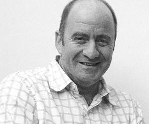
David Kester
Meeting David at Design Indaba 6 reminded me of my father. A man I adored. My father worshipped Peter Sellers - and David bears more than a resemblance to the comic genius. David has that grace, ease of manner, beautiful diction and a delivery of our language that is only bestowed on Englishmen. Just the kind of credentials we need for the figurehead of our industry. For our industry needs a man with these talents. The Barbarians are at the gate, and time is running out. David is therefore our ideal defence against the Philistines - with apologies to Corporates and Government. He talks their language, he knows their minds, he is smarter than them. David is charming, engaging and totally without pomp. Thank God.
Someone said to me 'he was with Greenpeace you know'. Whether this is true or not, I suspect that surviving the jungle that is advertising and design, is far more stressful than saving the planet. Good training indeed for the guy who fights the fight. When David was appointed to head British Design & Art Direction, the organisation was in poor shape. These past eight years has seen D&AD grow beyond all expectations - and in every direction. David has been instrumental in much of this - with more to come. In my view D&AD is the premier design award, and every designer I know would kill to get their hands on the thing we no longer seem to use - 'The Pencil". I know from long experience, having only made the Annual twice in years of trying. Believe me, easy it ain't! You pay your money and you take your chances...
I have heard criticism that the organisation is mainstream, very Londony and does not recognise the movements that have arguably changed design forever. Punk for one. The other "movement" not yet recognised by "London" (but is elsewhere) is for me, very personal. "Multi-culturalism, multi-everything" will be the next "big thing". For the world in which we live is no longer about being English, German, Croat or Inuit. But about being connected to each other by shared experience, by the blood of Africa that flows through all our veins. Design has allowed me to travel the world, carrying with me the message that design can cross cultures, can heal divides, can improve peoples lives. For this is something we South Africans know a little about. D&AD is of enormous benefit to design education and the nuturing of talent for the future. Viva to them. However, there's a little communtiy at the bottom af Africa that needs your help, and help now.
I fervently believe that South Africa could be the launchpad for what I call the " Third World Way". The world is no longer a series of islands peopled by nations. We are one nation, one people under a common sky. Travel anywhere, and you'll see the black, white, pink and green people (that Brown again) on every street, in every pub. The world is a fruit salad. More accurately a wors roll, for the fruit salad must allow for the indigenous fruit of the nation - the wors part of the roll. Having successfully managed to transform our society (with a long way still to go), South Africans are well placed to initiate a common global design language. We have the will, the skills and the technology. Somewhere between London, New York, Bombay and Mexico. A place like downtown Jo'burg.
To help us get there we need David. For David is a "Very Important Man". Soon to head up the British Council, an organisation that is hugely supportive of our creative industries, David will be the ideal partner to pave the way for local designers to bite global design in the leg. It's the only way we will get them to see what we see - in a new way. We have been forced to remove our Euro tinted glasses and to see, to create, to feel and to speak the language of colliding cultures. The language of those who come from some place else. Like the world out there.
I understand that David was deeply moved by his visit to the townships of the Cape Flats. No doubt he was inspired by the spirit of optimism, laughter and sharing. Uniquely, these are people on the way up - not the way down. We have nowhere to go but upwards. Towards our blue African sky. David, our hands reach out to you. Join us, and together we can travel the creative heavens.