


A range of placemats, coasters, tea towels, aprons, cheese boards, trivets and wall art with Ed Suter's vibrant, South African-inspired, photography can now be seen in Mr Price Home stores across the country. We asked him about this exciting collaboration, his inspiration and South Africa's visual identity.
How did the collaboration with Mr Price Home came about?
I think I was on Mr Price's radar but I was approached by Adrienne Sparks, the trend and design manager, at this year's Design Indaba Expo. We had a brief conversation and then a few weeks later Sparks and Yanni Vosloo, the merchandise director, visited me and told me about their new Co-Lab project: working with different designers across different platforms to create a range for Mr Price Home. They gave me 10 days to come up with some concepts and then I went to see them at their HQ in Durban to decide on final ideas and to work with their in-house graphic designers who helped me.
Can you tell us about the different pieces you have developed for the retailer.
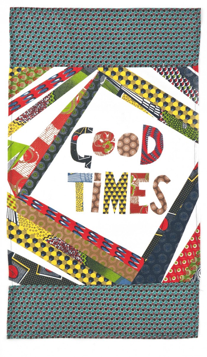
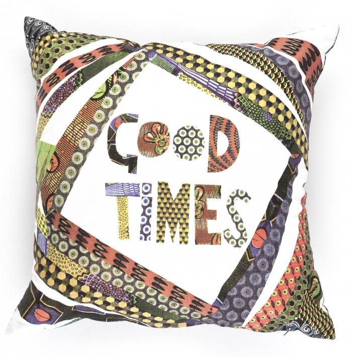
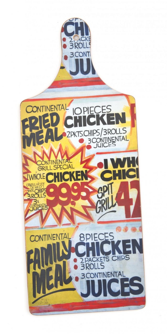
There are three different concepts under the name "Good Times". The designs have been used on cushions, tea towels, aprons, a cheese board, trays, pouffes and wall art. One idea was continuing with the street sign imagery that I have used in some of my work - it's humorous, very local and colourful but here it is also combined with my love of African fabrics. Most of the designs are completely new ideas: the dancing couple are central to the Good Times theme, I wanted those images to feel that they were timeless: to have a retro feel but with a contemporary spin overlaid on it. I was very specific about the clothes - the dress had to have the right shape and be able to do a good spin when dancing. I was also inspired by a great book I have of Blue Label jazz album covers from the 1950s and 60s.
What is it about your work that you think resonates with people?
I try not to dwell on that too much because I find it hard to be analytical about my own work. I think there may be something in the outsider/insider position I'm in. I grew up here but went abroad for a long time. I think I came back and noticed things that other people may have taken for granted. It was a sort of re-birth for me, I felt like I was in a land of colour and energy and wanted to bring that out in my work. I am not distracted by whimsy and try to avoid cliched images of South Africa - there can be an unusual hardness in my subject matter but it is treated lightly and with humour.
How would you describe your style of photography?
I think I'm in an unusual position - I get to do the work I love for my own products and then I try to bring that same aesthetic to editorial or commercial work. I just photographed 11 exciting talents in film, music, fashion and architecture for Elle magazine but out on the streets. I deal in reality, my work doesn't have a fantasy element to it, but I aim to bring energy and fun to it. My style of photography is more thought-through than it may appear. I often have a very clear idea of what I want to achieve but am also prepared to go with whatever is working in the moment.
What camera(s) do you shoot with?
My old war horse of a Nikon D200 mostly, although I used a Canon 1D Mark 3 on the Mr Price studio shoot.
What inspires you?
I think I am inspired by so much around me, and by individuals who bring energy and colour to the world. I find individuals and their stories fascinating and am inspired by those photographers who can bring that to life in their work. The book Big Up by photographer Ben Watts is a big inspiration. I am also hugely inspired by graphic designers. My favourite book at the moment is a monumental book on the work of graphic designer Saul Bass, it completely inspires me.
What are some of the unique features of South Africa's streets?
I love that there is a feeling of over-stimulation: bright colours, hand painted signs with humourous names, bright fabrics, taxis hooting, odd things for sale on the pavement, people talking on landlines set up on tressle tables, those plastic bags filled with fluffy chips! There is never a dull moment.
What is your favourite place in South Africa, and why?
I love the city streets: Halt Road in Elsies River, the downtown CBD of Jo’burg but I also like to get away too. I don’t travel nearly enough but I really love Churchaven on the West Coast: the colour of the water is amazing.
Do you think a unique South African "visual identity" exists? If so, what are the characteristics?
So many people come to South Africa because of its scenery so I understand that a lot of our visual identity is based on that but my book Sharp Sharp was a response to what I thought was an over-reliance on South Africa's natural beauty as its visual identity. I am not by nature a landscape or wildlife photographer, so I have created a visual identity out of what I feel attracted to and am more confidant photographing.
How do you think your pieces in Mr Price Home will be received by consumers?
I hope that the consumers who have bought my placemats and coasters will be pleased to discover my designs on fabric and on new products like the trays and the cheeseboard. I know that often my products are sent to family members living abroad as they are unusual reminders of home so maybe there will be a few cushion covers winging their way across the world this Christmas.
What's next?
My new set of placemats, "Classic Stripes" will hit the shops next week so I'm looking forward to seeing the response to them. Obviously, I have Design Indaba to prepare for. I am always working on new ideas, and I'm excited about a new idea that will take me to shoot in the Eastern Cape. It's early days on that one.