With genuine inclusivity at its core, #WeThe15 was conceptualised by British communication company, adam&eveDDB in partnership with the International Paralympic Committee, to coincide with the 2020 Tokyo Paralympics. The campaign identity was designed by former #DI Speakers and Pentagram partners, Yuri Suzuki and Harry Pearce. #WeThe15 has set out to become the world’s biggest human rights movement in history.
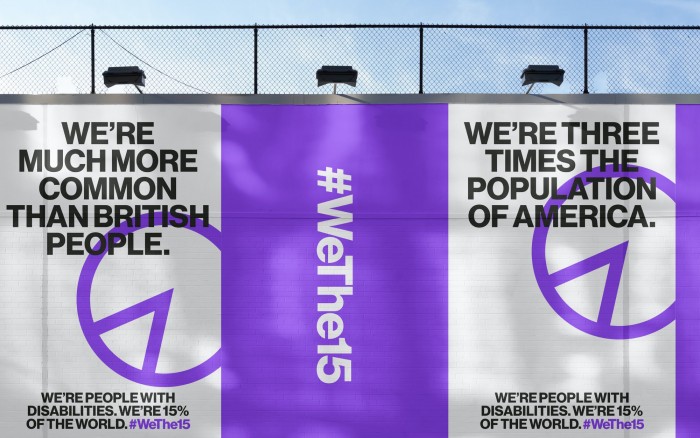
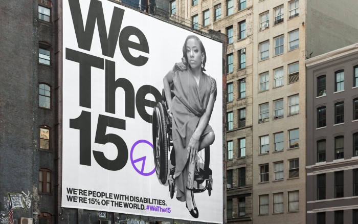
#WeThe15 represents the 15% of the global population living with a disability, amounting a staggering 1.2 billion people. While making up such a large percentage of the population, people living with a disability are often still excluded from inclusivity movements.
As a result, they lack basic human rights - including access to healthcare, education, employment, and more. Naturally, the pandemic has worsened the situation, disproportionately impacting persons with disabilities. The #WeThe15 campaign puts persons with disabilities at the heart of diversity and inclusion.

The campaign, written as a hashtag in order to ensure maximum social media visibility, has an identity that includes a wordmark, a symbol by Pearce and the Pentagram team, and sonic branding by Suzuki. The symbol represents 15% on a pie chart. Twenty organisations have backed this campaign, including the UN, UNESCO, and the International Disability Alliance.
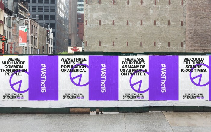
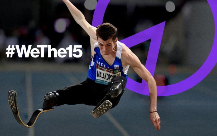
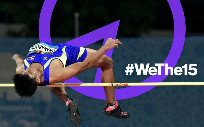
The symbol is a purple shade, representing the international colour of disability. The Paralympic Games athletes wore temporary tattoos with the #WeThe15 symbol in support of the campaign, and 90 landmarks across the globe were illuminated with purple light to show their solidarity, including the Empire State Building, Colosseum, and the London Eye. A short film created by adam&eveDDB also introduced the campaign at the Paralympics opening ceremony.
Suzuki and his team created the sonic branding for the campaign so that it could be experienced by the hearing impaired as well. “The sound design was crafted to be as inclusive as possible, for all abilities of hearing. To achieve this, the sound design team used rigorous hearing loss tests by simulating the loss of high, mid and low frequencies, making sure that the identity can be heard across all three of these,” writes Suzuki. It rhythmically spells out “We The 15” across the three octaves.
We salute this amazing campaign.
See more:
Playful sonic sculptures that reverberate across the design world.
Harry Pearce on useful uselessness in graphic design.


