Spaceship Earth
When the pioneering designer R Buckminster Fuller wrote Operating Manual for Spaceship Earth he gave us a handle on how to see our Spaceship in a holistic way. Likewise, his Dymaxion Map shows the world as pretty much a single island floating in a sea of blue. Unfortunately, we don’t treat it that way. Not yet.
We’ve either forgotten to read the manual, or we’re stubbornly piloting our ship towards disaster. Our demise, unlike the Titanic’s, will be no accident.
But yes, it is all too easy to be critical of the state of the planet when the errors are so obvious. And yes, it is much harder to take responsibility, in a personal and collective capacity, for the environmental disasters that have occurred. It’s even harder yet to fix them. Some of the damage may already be irreparable.
I know I’m stating the obvious here. But how many times does it need to be stated? There’s also the question of how to state it in the first place without suffering self-righteousness or cynicism. And then what’s the point, I ask myself, of devoting one issue of a magazine to the green movement, as if that solitary moment of heightened eco-consciousness will suffice to mitigate the apathy of all the “non-green” editions to follow.
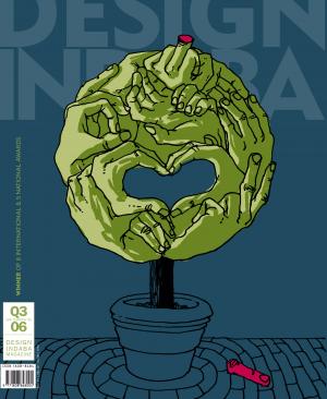
Hopefully, this issue of Design Indaba magazine serves to treat the green movement as more than a handy theme for publishing. I choose to take a leaf out of House and Leisure editor Lianne Burton’s tree, and ask, like her, that environmentalism be integrated into everyday life, so that the green designs and ideas presented within these pages provide the starting point for their integration into ol’ Bucky’s Spaceship.
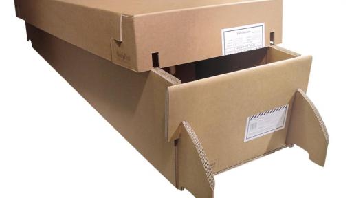
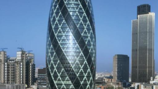
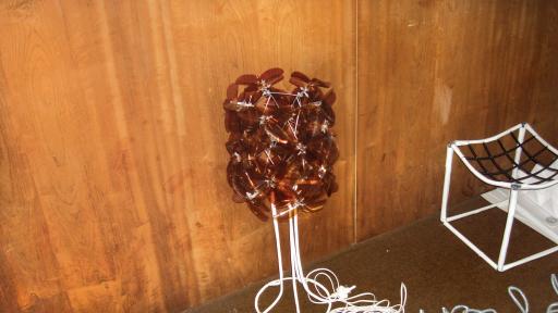
Green designs will certainly be integrated into future copies of this magazine, just as they have been covered already in back issues. But when you choose to present the verdant field of green design – from eco-tecture all the way through to recyclable product packaging – as a thematic whole then this raises an interesting creative question: What design language should be used for the supporting media structures and should this language have any differentiating factors?
Faced with this question, I asked our award-wining designer Richard Quintal to not only lend our Green Issue a distinctive style, but to design a unique, print-ready colour for the text. Please use our recipe (Cyan 75%; Magenta 56%; Yellow 100%; Black 65%) whenever you need to spread the green word.
Alternatively, share your green ideas with us. - Lauren Shantall

