How people interact with a built environment and surrounding city infrastructure is a key focus in the practice of urban planning. Sometimes finding a solution to a dysfunctional urban system is a matter of working with what you’ve got as opposed to building something from scratch. This was the case with the municipality of Austin, Texas and their resourceful means of making one of their busiest intersections pedestrian-friendly.
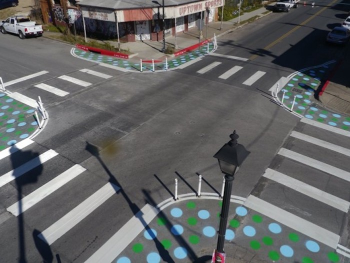
In a bid to keep pedestrians and drivers safe, the city council devised a low-cost but effective plan to address the hazardous East 6th Waller Street intersection, and all it took was a bit of paint and visible signage. The lack of crosswalks or and high traffic is a problem in the area so the council started by laying down bold white stripes on the roads to clearly mark pedestrian crossing points.
They strategically installed polls to act as dividers between pedestrian spaces and the roadway and added stop signs at each corner of the crossing. Instead of spending council money to extend the curbs with concrete, the planners painted bold blue and green dots, on the road around the pavement corners. The low-cost method is visible to drivers and helpful for pedestrians.


