Part of the Project
From the Series
First Published in
Dana Arnett: How did you develop your personal style?
Paula Scher: Discovering that I could create mood and spirit with typography was amazing for me. With art direction I knew how to utilise images to make an impression, but figuring out how to do it with type was much harder. It is easier to make an analogy to something if you have imagery, but you can still formalistically create spirit and mood if you don’t have imagery.
Dana: Maybe this is why I identify with your work. Whether it is a complex environment or something as simple as a poster, there seems to be a singular statement being made. You don’t compartmentalise. Although there might be a lot going on, there is always something that hits you with an immediacy and continuity that is powerful. I think we both come from a place where we take elements that are classical and figure out ways to juxtapose and elevate them.
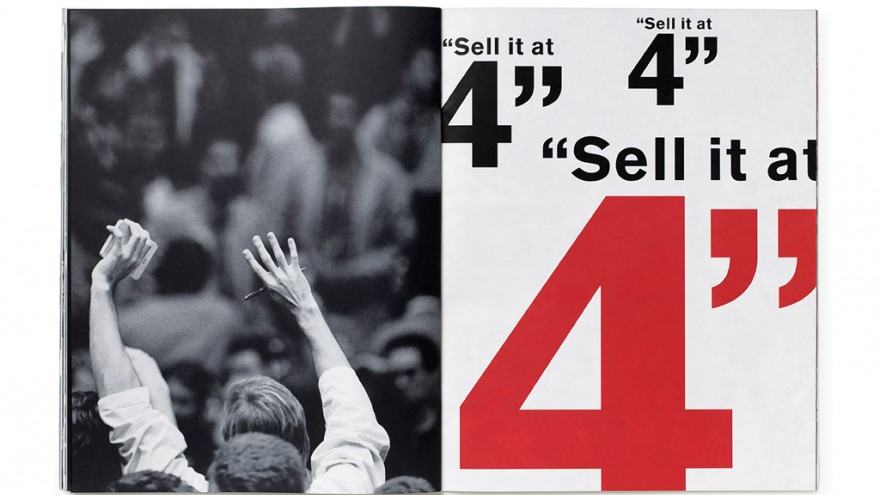
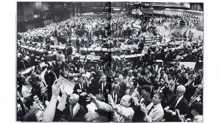
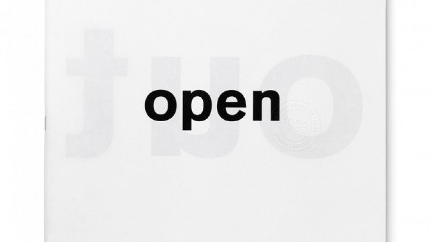
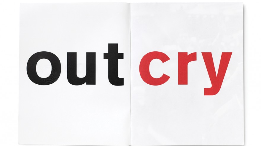
Paula: Definitely. I mean, I still remember your Chicago Board of Trade work from the early 1990s. I remember being completely astonished by the craft and scale of the letter forms, and how they were as powerful as the organisation itself. The design mirrored the action. It made you want to find out more about the company simply by looking at the design. I was never interested in financial institutions or financial reporting, because of the overwhelming landscape of corporate communications and annual reports at that time, but that work made me stop and pay attention.
Dana: Annual reports in the 1980s, whew. I remember there was usually one of two ways to approach that particular medium of investor relations. Designers would either impose their own creative house style that didn’t actually express the look of the company at all, or designers would comply with convention and the annual report would quickly fall into a category of bland corporate expression.
Paula: Do you think that people still know what annual reports are? They were an incredible design industry about 25 years ago, and the bread and butter for most designers. They are really like relics. Now and then you still come upon one that is designed with all kinds of fancy things – a pastiche of paper, ink, foil, stamping… I mean, what possessed us? When you consider illuminated religious manuscripts that expressed the power of the church, were the corporations the churches of the 1980s?
Dana: I think your points are right. When the Enron scandal hit, the reporting laws were rewritten and content legally started to migrate towards online reporting. It was basically one swift sword that forever changed the way a company communicated, the very way corporate communications functioned. But before that, I remember firms like VSA and Pentagram did reports that were vivid and significant strategic expressions of a company. Both of our firms worked on a couple of Coca-Cola annual reports and I will always remember their chairman pulling out his annual report at one of their all-company meetings and saying to his employees that this was the one book he chooses to carry in his briefcase. He didn’t necessarily want people to sit down and read it, but he wanted people to know that everything they needed to know about the company lay in the annual report. Sadly, in a day and age when companies need to instil confidence and passion in their employees and constituents, there’s not a whole lot of communications of this ilk or stories like this happening.
Paula: I also remember how stockholders felt about getting those incredible objects. There was something about the scale of them, the fact that there was perfect binding and the thickness of the spine. It made their investment seem substantial and believable in a way that we don’t feel about anything now. Everything is transient and instantaneous, especially information. Even your transactions. You don’t even have any loyalty to your own stock options in the company you buy.
Dana: I think companies are struggling right now because they’re not able to position themselves in a credible way. Consequently the media is doing this for them. Maybe this sounds too idealistic, but I believe the companies that are truly going to succeed in this new economic landscape are the ones that will figure out how to communicate better and define their bigger purpose in the world for their audiences.
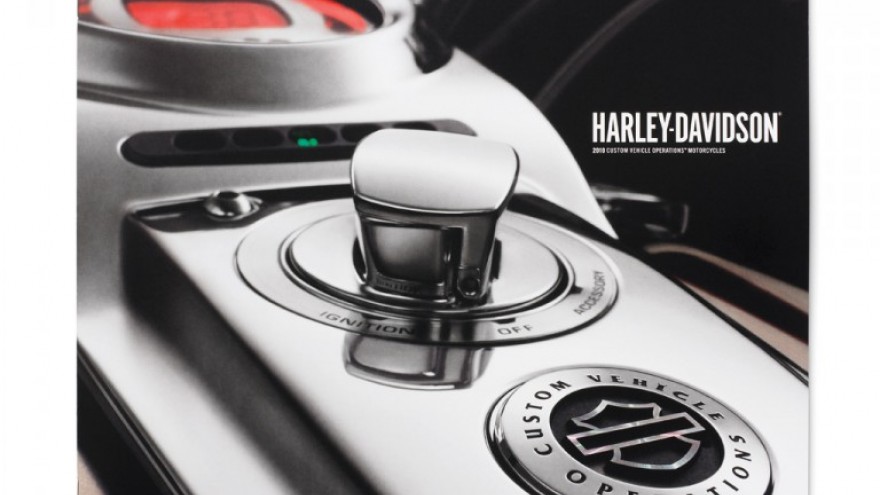
Paula: That is funny because I think one has proclivities. It is not accidental that your most iconic work is with Harley-Davidson. I can’t tell the difference between where you start and they go. I mean, come on, you’re a biker. You are a guy who wears silver jewellery. I remember thinking the first time that I met you: Did they invent you or did you invent them?
Dana: I’ve always been emotionally attached to Harley based on my lifelong love for motorcycles. But Harley-Davidson, on a larger level, is also steeped in a more compelling idea, which represents emotions such as passion, rebellion and the freedom of the open road. That’s resonated for me and I suppose it’s those very things that have found their way into my design. Design simply provided me an outlet to emotionally depict that passion.
Paula: Well, that’s a complex association.
Dana: That’s how some people would interpret it. But don’t you also think that much of the greatest design ever produced has been grounded in a person’s love of the subject matter? I would also say there’s an emotional core to each and every organisation that a designer can tap into. I simply try to circle around that essence, and then shape and distil it into a compelling expression.
Paula: So what do you most like working on now?
Dana: Believe it or not, we’re starting to do a little bit of advertising and I’m actually enjoying it. Different from design, advertising has challenged me to translate an idea into a more condensed solution – a 30-second spot or a single ad. It’s actually a fresh and interesting way to reinterpret design to a certain degree. I also believe there’s is a lot of value that design can bring to advertising and vice versa.
Paula: Do you get involved in the writing?
Dana: I believe writing is fundamental to any creative assignment. Fortunately for us at VSA, writing has always gone hand-in-hand with design. So yes, I do get involved with writing but I’m not a writer per se. With our expansion into advertising and rich media, I’ve been able to translate my thinking (writing) just as I did as a young filmmaker. Early in my career I did a lot more writing when I was directing films.
Paula: I kind of forgot about how film was a very serious part of your work.
Dana: The thing that is so refreshing now is that in the old days you had to figure out how to fund all that, because the costs were so enormous. Now with the emergence of digital filmmaking and the deceleration in costs, you don’t have to face those odds. These days you have a lower barrier of entry and a lot more freedom. The great thing that a designer can add to filmmaking is that we were trained to interpret content like a storyteller, which is what naturally drew me to films in the first place.
Paula: I am fascinated by how many of my designer friends have brought up their children to be filmmakers. Besides having visual parents, their children’s whole life experience has really been making movies, because the camera wasn’t some exciting thing that you had to be wealthy to have. I am more impressed not just with the content, but with their natural comfort at being able to make a film anytime, anywhere without the discomforts, the expense, the nightmare of it.
Dana: What is interesting too, I was listening to a lecture a year or so ago, where they were saying that because we live in the age of YouTube and reality-based programmes, younger people are actually questioning the authenticity of a company or their products based on the production quality of what they see. If they see something too polished, they are going to immediately question whether it is truthful or not.
Paula: But don’t they know that something that is unpolished can be just as big a lie?
Dana: Well, I am sure that is the case, but you know by virtue of things looking real and spontaneous…
Paula: But in fact reality-based things are “reality based”, they are not real.
Dana: This guy was testing young audiences and gathering reactions to countless products tested. When they saw this product being expressed through a homemade video or on YouTube, the viewers experienced a stronger appeal and sense of authenticity. It clearly signalled that that younger viewers would rather seek the “real story” elsewhere than a company’s own website.
Paula: That is very depressing! I understand that there has always been a form in which things that were highly polished and finished were considered slick, and things that were rough were authentic. I think that it comes from the belief that there is something that is instantaneous and uncensored about an action that happens so quickly that it has imperfections. Typography is like that. If you make the type too slick or it is too computer-driven, it develops a level of perfection that makes you sort of turn away from it because we don’t see it as authentic. But you have to know that nothing is authentic because somebody is always controlling it.
Dana: Okay, imagine if you want to buy a vacuum cleaner. You might naturally go to Google and type in Dyson Vacuum and the Dyson website will likely pop up first as they have optimised their search...
Paula: Why can’t it be Hoover?
Dana: It might be. But a more adept, younger digital consumer might be inclined to go to a place or a site that shows the vacuum actually being used by someone that owns one. In their mind, this person would be suited to provide an unbiased and honest review of it. A video showing a real demonstration versus a corporate propagation of it on a corporate website is likely to become more authentic to today’s consumer.
Paula: And you will treat this as if, because somebody is giving a personal view and demonstration, that this is more to be believed than a corporate website? Isn’t that silly? It is all manipulation. Why would one believe that one guy’s opinion about anything anyway? As much as you can’t believe the corporations, I don’t trust most people’s opinions about most things without knowing something about it myself. I mean you just can’t do that. I thought that people were more advanced, but maybe I am wrong.
Dana: We could argue about this forever, let’s move on. What do you think about the profession?
Paula: I am actually very optimistic about the profession of design. On a personal level, the past five years have been a great time for me, because I have pretty much become an identity designer. I don’t call it branding, I call it identity. Branding is something that may happen in part as a result of something that I do, but it is not what I am doing. I am trying to make things recognisable. A brand is what somebody else brings to it, not me. It is what the audience feels about it. What is exciting about making things recognisable now is that they have to be recognisable on every platform. It has to be recognisable online, on a person, in another country, in a different language, through a building or space… The bottom of a shoe has to be recognisable. This is totally fun because you can create some premise and the premise can extend forever. You get to make it move, make it big, make it little and even make it intangible or sometimes give it smell. You can do all kinds of stuff, which you never got to do before.
Dana: I’m equally bullish. Now that we’ve officially entered the “Web 2.0” era, we’re getting back to some of the more important aspects of information and design. In other words, our infatuation with digital media is wearing off and we’re returning to things that matter, like content and design. Our first 20 years of digital design relied so heavily on “getting up to speed” on the basic technical issues relating to typography, composition and colour. It was if we were all forced to step back and rationalise how design could work within the confines of the particular technologies. And now that many of those utilities have matured so beautifully, we’re free to do more than ever. Sure, great designers have, and always will be, measured and appreciated for their talent and not their tools. But now, there seems to be more equilibrium and this excites me. So let’s get on with things, eh? Let’s start the next design revolution!

