


From the Series
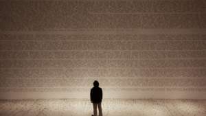
Drowning in a sea of words. That’s almost what one feels, looking at Tokyo-based designer Ryo Shimizu’s CNJPUS TEXT installation.
An alphabet of “converted characters”, the CNJPUS TEXT installation covers a rather large space, measuring about 12 x 4 metres. Shimizu experiments with what a hybrid Chinese-English font might look like. He explains that he borrows mostly from existing Chinese characters with some strokes deliberately missing.
The end result may also be defined as exhibiting the characteristics of both phonograms and ideograms. It is also representative of the age-old Japanese character, whereby something from the outside world is emulated, experienced, adapted and improved for the Japanese environment.
The text comprises allegories drawn from scenes that come from Shimizu’s memories and dreams, but also from actual events and social phenomena. He says: “The generated space becomes the CNJPUS Galaxy that in turn generates an experience of ambiguity, a ‘noosphere’, such as reality and fantasy, life and death, orthodoxy and heterodoxy, destruction and creation, and doubt and salvation.”


