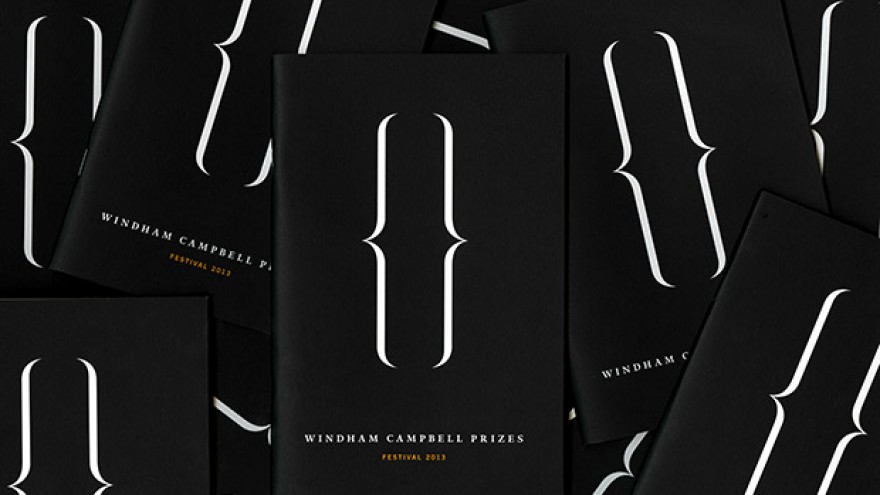
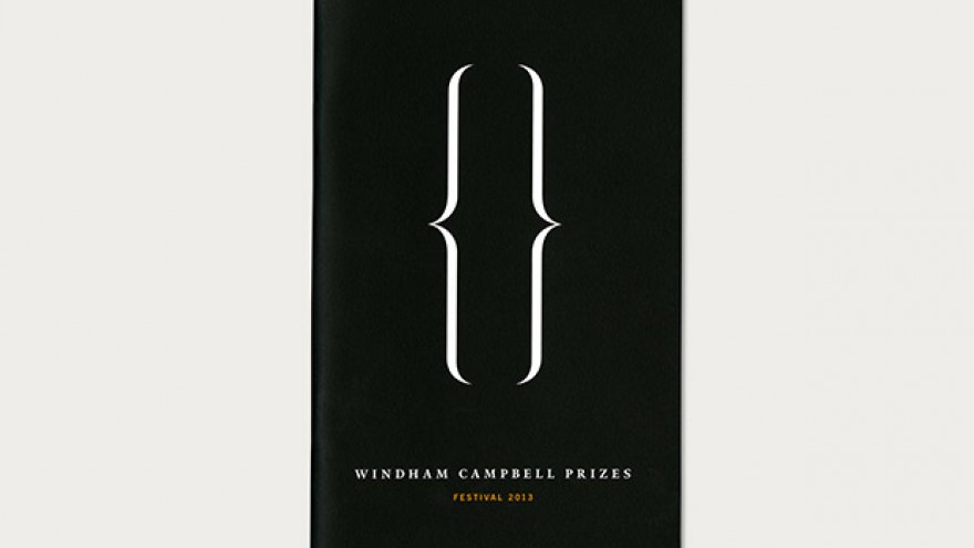
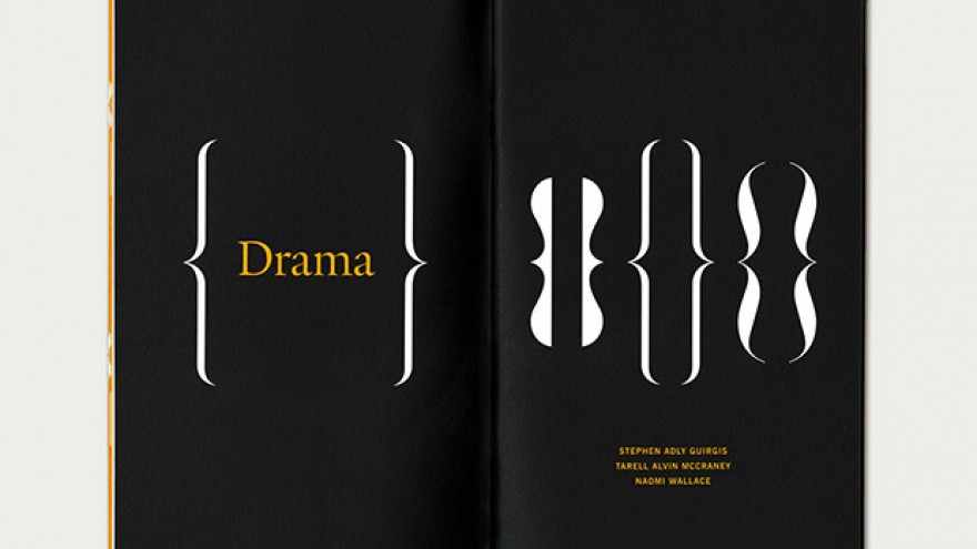
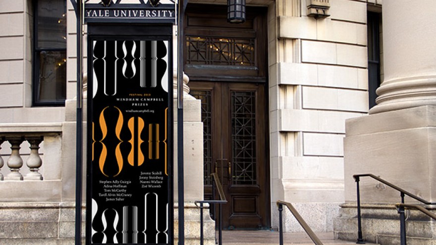
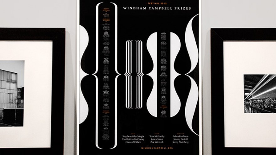
Michael Bierut designed a distinctly typographic identity for the inaugural Windham Campbell Prizes.
Presented by Yale University, the Windham Campbell Prizes honours outstanding achievement in fiction, non-fiction and drama. As the awards are for literary prizes, Bierut designed an identity that is distinctly typographic in character.
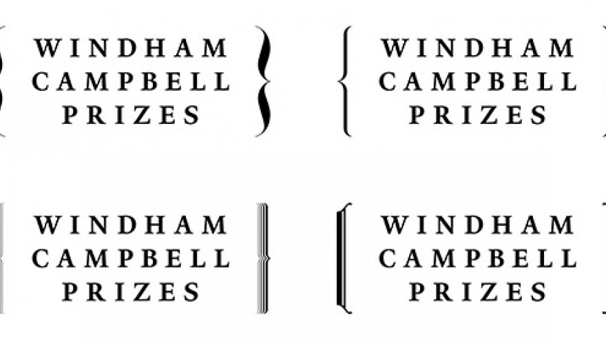
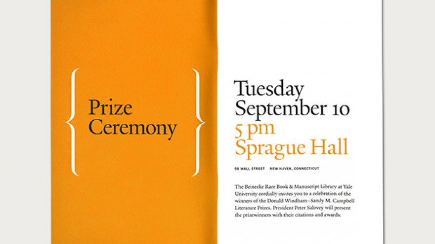
Based around the elegant graphic motif of brackets, the identity falls directly inline with that which the awards celebrate. Appearing in various forms, the brackets are familiar symbols of language and also convey diversity and inclusion, important elements of the awards.
While the prizes are a celebration, not a competition, we hope that the announcement of the winners of a literary prize like this might engender the same kind of excitement that college sports do, on campus and with the general public, says Bierut.
The main typeface used throughout is "Yale", designed by Matthew Carter exclusively for the University. The different brackets, which come from dozens of different sources, reflect the wide variety of prize winners, who range from noted South African writer Zoë Wicomb to playwright Stephen Adly Guirgis and journalist Jeremy Scahill.
The Windham Campbell Prizes is one of the largest literary prizes in the world, awarding nine winners with $150 000 each.

