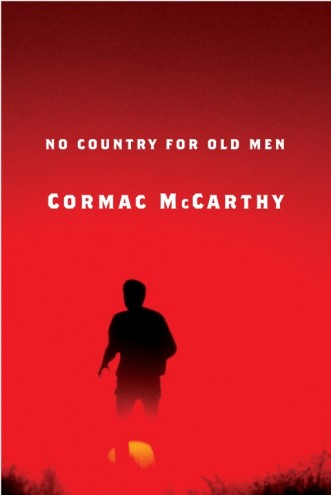
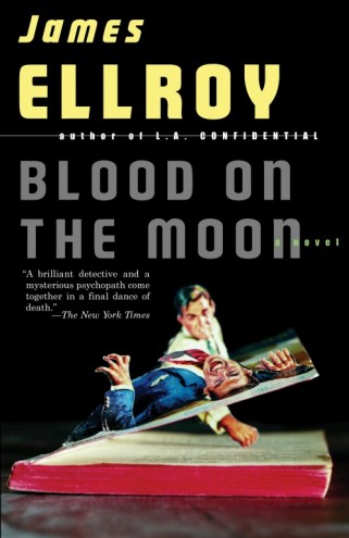
First Published in
While record sleeve designers occupy a lofty position in graphic design's pantheon, their contemporaries in book publishing rarely receive the celebrity treatment. While the former boast such stars as Peter Saville, The Designers Republic and Stefan Sagmeister, there is really only one book jacket designer with a comparable profile: Chip Kidd.
Creator of well over 1500 covers (he stopped counting some years ago) Kidd has been credited with helping spawn a revolution in American book packaging. And he has achieved this with just one main employer - New York publisher Alfred A Knopf whom Kidd joined straight out of college, 19 years ago.
An imprint of publishing giant Random House, Knopf deals with what Kidd terms "mainstream trade books": Bret Easton Ellis, Peter Carey and (on the Vintage imprint) James Ellroy, all number among its writers. It's major publishing, not the kind of art house environment which many designers require in order to flourish. Deadlines are tight: Kidd typically has just two weeks between receiving a manuscript (yes he does read them) and delivering a cover. "But I've worked in publishing long enough to know how the sausages are made so in reality we may have six months," he says. "Unlike newspapers or magazines, publishers will delay a book if the cover's not working out."
Despite working for one of America's major publishers, Kidd says that he has never looked at what he does in terms of packaging a product. "In a sense, I'm in an ivory tower as I just try to think of what's the best thing for that book." Occasionally he is asked to "make it look good from 50 feet away, which implies that people have really long arms" but claims rarely to come under the kind of client pressures familiar to his peers in other sectors of graphic design. "The one thing you do sometimes hear is that they want a big book look - does that mean the type is all big? It's foil stamped? Embossed? What they are really saying is that they want the book to be a bestseller and they seem to forget that a bestseller can look like anything - it doesn't have to scream at you or jump off the shelf."
But despite this freedom, there is one final arbiter who really does have an influence over Kidd's work: the author. "At Knopf, no matter who the author is, we are going to try to make them happy, even if it's not in their contract," he says. Authorial interest in jacket design varies from case to case and, says Kidd, as opposed to record sleeves "the one thing you'll never get from an author is 'I want my picture on the front'." Kidd claims not to be "a good attorney for my work: I'm very bad at defending it," which frequently results in the design going through several very different versions before publisher, art director and author are happy. Mostly, his work features photography rather than illustration as "photography has a sensibility that works better for me than most illustrators".
His acute sense of imagery matched with restrained typography ensure that Kidd's work achieves that rare balance of appearing both modern and timeless, with a healthy dash of mischievous humour. Only once has a design landed him in trouble - not surprisingly, it involved a cover of the New Testament. Kidd wanted to use a photograph by Andres Serrano entitled Murder Victim Number Five. "To me it was perfect," he says. "The publishers went for it, but it was a total disaster for them - no religious bookstore would carry it." The reason, Kidd says, was not because of his cover per se, but because earlier, Serrano had made Piss Christ, a photograph of a crucifix immersed in his own urine, and so became persona non grata.
As well as his work at Knopf and a thriving freelance studio designing jackets for other publishers, Kidd has written several books on his great passion, comics and, specifically Batman (as well as a novel, The Cheese Monkeys).
He has been one of the main protagonists in the drive to get the graphic novel taken seriously as an art form.
Choice of materials is fairly limited: "you may get a choice between matt or gloss, maybe vellum or acetate." As many books become treasured possessions, he is "always trying to think about what this will look like in 10 or 20 years time, which is probably why I'm not very adventurous with my type because it dates so quickly."


